An Introduction to the Graph eZ Component
The different parts of a graph are separated into independently configurable chart elements, such as the title, the legend, or an axis. This not only allows you to use different colors or fonts for each chart element, but to also define their positions and sizes. The main chart elements are the same for all chart types. Default, overall graph layouts can be defined by palettes, which specify element colors, symbols, fonts and spacings.
Chart data is held in ezcGraphDataSets, which typically takes the form of simple arrays. As you will see, statistical operations can be performed on the data.
A more in-depth tutorial is available, and is referenced throughout this article. API documentation is also available.
The Graph component supports three chart types: bar, line and pie charts.
Bar charts
At the very least, after calling the Graph component and an existing dataset, the code to create a bar chart consists of only three lines.
<?php

require_once '../tutorial_autoload.php';
$wikidata = include '../tutorial_wikipedia_data.php';

// Create a bar chart
$graph = new ezcGraphBarChart();
$graph->data['German articles'] = new ezcGraphArrayDataSet( $wikidata['German'] );
$graph->render( 400, 150, 'example_02.svg' );

?>
First, you must create the chart object, which also defines the type of chart. Referencing the existing dataset, you then assign an array with key-value pairs containing the data. Finally, you render the chart, specifying its size, to a file.
Line charts
Line charts are very similar to bar charts, but use other default axis renderers (see the tutorial for more information) and another display type for the dataset. Therefore, in order to create line charts, either use the ezcGraphLineChart class, or set the display type of the desired dataset to "LINE" (as is done in the example below).
<?php

require_once '../tutorial_autoload.php';

$graph = new ezcGraphBarChart();
$graph->title = 'Random data with average line.';
$graph->legend->position = ezcGraph::BOTTOM;
$graph->palette = new ezcGraphPaletteEzBlue();

$graph->xAxis = new ezcGraphChartElementNumericAxis();
$graph->xAxis->axisLabelRenderer = new ezcGraphAxisBoxedLabelRenderer();
$graph->xAxis->majorStep = 1;

$data = array();
for ( $i = 0; $i <= 10; $i++ )
{
    $data[$i] = mt_rand( -5, 5 );
}

// Add data
$graph->data['random data'] = $dataset = new ezcGraphArrayDataSet( $data );

$average = new ezcGraphDataSetAveragePolynom( $dataset, 3 );
$graph->data[(string) $average->getPolynom()] = $average;
$graph->data[(string) $average->getPolynom()]->displayType = ezcGraph::LINE;
$graph->data[(string) $average->getPolynom()]->symbol = ezcGraph::NO_SYMBOL;

$graph->options->fillLines = 150;

$graph->render( 400, 150, 'example_03.svg' );

?>
This example is far more complex and shows more of the Graph component's capabilities. As stated earlier, each chart element can be configured independently. To show this, we set the position of the legend in line 7 to display at the bottom of the chart. The title, whose text is assigned in line 6, can also be set to use a different font or to display at the bottom of the chart.
You can create your own palettes to style your charts to fit your own color scheme. In this case we use the ezBlue palette (on line 8) to automatically define the colors for the chart. Otherwise, the default palette would use the color scheme defined by the Tango Desktop Project.
The axis can be of different types to render data differently. For bar and line charts the default x axis is the labeled axis, which is intended to render string labels. Because we only have numeric data in this example we use the numeric axis (on line 10). There is also a date axis and an axis for logarithmic-scaled data available.
From line 14 to 21 we generate some random data and create a dataset from that. From this data we create another type of dataset, which tries to determine an average polynomial of a certain degree, approximating the given data using the least squares algorithm. We can switch the display type between line and bar charts, as is done in line 25.
Each dataset has a symbol that is used in the legend in line charts at each data point and as the general shape for bars in the 3D renderer. Finally, on line 28, we set an option to shade underneath the lines, then we render the chart.
Pie charts
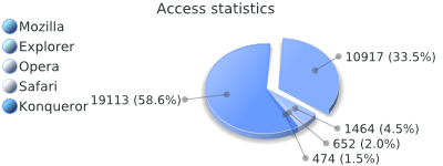
Aside from the obvious display differences, there is only one functional difference between line / bar charts and pie charts: pie charts can only accept one dataset. There are also some special configuration options that are explored further in the tutorial or in the API documentation. The first image in this article is an example pie chart rendered with the 3D renderer. The source code for this example is available.
Nearly every aspect of a chart is customizable. For example, the 2D and 3D renderers can both be used with all chart types. For more information on this, see the tutorial. You can even create your own renderer by extending the abstract ezcGraphRenderer class.
Driver
The output drivers are used to create different image file formats. Graph supports rendering bitmaps (jpeg, png) using PHP's GD extension, Flash SWF files using the ming extension and SVG files using the SVG driver.
To use another output driver, simply assign it to the driver property of your chart object:
$graphdriver = new ezcGraphFlashDriver();
Each driver has several unique configuration options, but in most cases the default options will work. You can read about these options in the tutorial or the API documentation.
Additional modifications
With the GD and SVG drivers, we support element references so that you can link parts and elements of your chart. The GD driver gives polygon coordinates that can be used to create HTML image maps. The SVG driver returns the IDs of the elements so that you can use standard DOM operations to reference or link to the elements. You can see this link feature live in action on busimess.org.
Creating custom palettes is described in the tutorial. To explore the available dataset types, axis types, renderers, axis label renderers, drivers and chart elements, see the complete API documentation, which is supplied for all eZ Components.

