Layout of the eZ Publish Administration Interface
This article is the fourth in a series focusing on concepts and features discussed in the newly released book eZ Publish Content Management Basics and is a short user guide describing the overall organization of the Administration Interface in general, and the Content structure tab in particular. We focus on navigation, the context-sensitive pop-up menu and the windows within the main area when the Content structure tab is selected.
This material is written for users who are unfamiliar with the interface and for content editors working with eZ Publish content through the back-end of their website. The intended audience has a basic knowledge of the object-oriented content model used in eZ Publish, including concepts such as content classes, content objects, attributes and datatypes. You should also understand how content objects are wrapped inside (or encapsulated) and structured using content nodes in a content node tree.
Administration Interface access requirements
The Administration Interface can, by default, only be accessed by users who are registered on the site and belong to the Editor or Administrator group. After logging in as an Editor, you can add and edit content. With an Administrator account, you can also add and modify user rights and other advanced settings.
Interactive features of the Administration Interface make use of JavaScript technology. This means that JavaScript must be installed and enabled in your web browser for such features to be available. JavaScript is a lightweight programming language that extends the functionality of XHTML. It is used in eZ Publish to create a more user-friendly environment, including the context-sensitive pop-up menu. The interface will still function correctly in non-JavaScript browsers, but will not be as feature-rich as intended.
The Administration Interface contains multiple windows, interfaces and tabs. We identify six areas of the interface and explain each of them in detail. When you log in, the Administration Interface defaults to the Content structure tab and displays the top-level node in the site's content hierarchy. In other words, you will most likely be shown the content from the front page of your website.
Areas of the Administration Interface
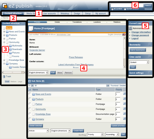
As shown above, the interface can be divided into six areas that are always present and in fixed positions. They are interactive and dynamic, with links and buttons to access functionality and perform operations. What is displayed in each area partially depends on the current context. Note that some areas are automatically disabled when you perform certain actions. For example, some parts of the interface do not respond during editing to prevent you from doing operations that are inappropriate for a given circumstance.
Here is a list of the six areas, numbered to correspond to the markers in the above screenshot:
- The main menu is a collection of tabs for selecting which part of the system you want to access and manage.
- The path shows the location of the current page within the content hierarchy, regardless of the current activity.
- The secondary (left) menu provides access to content and interfaces that are associated with the current tab.
- The main area displays the actual content and interfaces that are associated with the current action. This is where most of the work is done.
- The right area displays information specific to the user who is currently logged in, including the Bookmarks window.
- The Search interface can be used to find information on the system.
The main menu
The layout of the Administration Interface is identical for the first three tabs, because each tab merely accesses different parts of the node tree. The layout for the other tabs, however, is unique for each tab.
Clicking the Content structure tab displays the Content branch of the node tree, which holds most of the content that site visitors see. The Media library tab displays the Media branch, which often stores data (such as images) that are used by other nodes. In the User accounts tab, you can view and manage user accounts and permission policies.
The Webshop tab provides access to the built-in e-commerce engine (the Webshop) if this feature has been set up for the site. Visual elements and layout of the site can be managed through a graphical user interface accessed by clicking the Design tab. The main site configuration area is accessible by selecting the Setup tab. This area should only be used by advanced users and site administrators. Clicking the My account tab displays the current user's personal area. This area provides access to user-specific data and configuration, such as access to the user's own drafts and user account information.
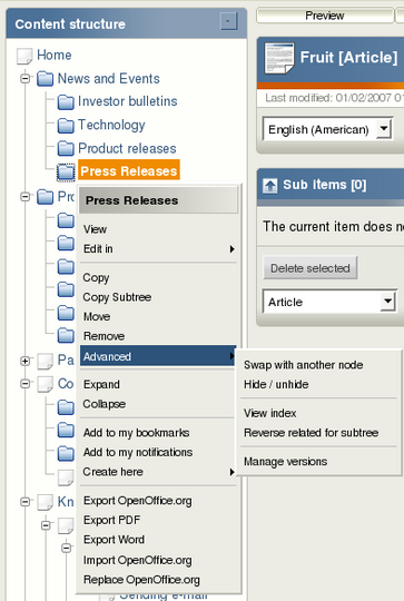
The JavaScript-based context-sensitive pop-up menu (or simply "pop-up menu" for short) contains functions that are specific to the item from which the menu was invoked. That is, the menu is context-sensitive, providing quick access to commonly-used functions. In the secondary menu, clicking the icon (with the left mouse button) to the left of the name of the node displays the pop-up menu. The following screenshot shows a pop-up menu.
Context-sensitive pop-up menu
This screenshot shows the pop-up menu in the Content structure tab. The title at the top of the menu is the name of the node or object that was clicked. In the example above, a node called "Press Releases" was clicked.
The following list is an explanation of some of the basic menu items on the pop-up menu:
- View: selects the current node and displays it in the main area.
- Edit: activates edit mode (where you can edit content using the Object Edit Interface) for the selected node. For multilingual sites, the text displayed here is "Edit in", and the sub-menu lets you select the language to use for editing.
- Copy/move/remove: triggers the corresponding action for the selected node.
- Expand/collapse: a feature that can be used to explore a subtree without having to repeatedly click the + and - buttons.
The horizontally-aligned switches at the top of the main area determine which windows (also called "panels") are shown within the main area. A blue background indicates that a switch is on and thus the window containing the related information is currently being displayed. If all switches are turned on at the same time, the windows appear in the same order as the placement of the switches (left to right): Preview, Details, Translations (for multilingual sites only), Locations and Relations. The Sub items window is always at the bottom.
Horizontally-aligned switches - all disabled
The same switches apply to the main area of the User accounts tab (which also has the Roles and Policies switches) and the Media library tab. The remaining tabs are not associated with viewing content, and thus do not have these switches.
Below, we describe the windows associated with the switches of the Content structure tab.
Preview window
When viewing some content, the main area will, at a minimum, contain the row of switches in addition to two windows (as shown in the above illustration). While the top window displays the contents of the selected node, the bottom window (the Sub items window) shows the node's children. The top window is known as the Preview window. Unlike the other windows, this window does not completely disappear after you deactivate the corresponding switch. Deactivating the switch will only hide the window's contents.
In its active state, this window has four parts: the title bar, information bar, object attributes and button bar. The title bar contains an icon indicating the object type, the name of the object and the name of the class of which the object is an instance (in square brackets). The information bar contains information about the version and translation that is being viewed. The left part of this area reveals when the object was modified, along with a link to the user who did the actual modification. The right area reveals the translation that is being displayed. The object attributes are displayed in the main area of this window in the order that is specified in the class definition. The button bar is located at the bottom of the Preview window, containing at least the Edit, Move and Remove buttons. These trigger exactly the same actions as the corresponding menu items that are found in the pop-up menu of the secondary menu.
Details window
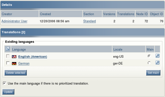
The purpose of the Details window (shown below) is to provide additional information about the selected node and the object that it encapsulates. Clicking the Creator or Section link will take you to interfaces for managing user accounts and access policies.
Translations window
The purpose of the Translations window is to show the languages that exist for the last published version of the selected object. This window and its associated switch are only available on multilingual eZ Publish sites. The currently selected translation is displayed using bold characters. The top of the window shows the number of translations, which is the same as is listed in the Details window:
Details and Translations windows
From the Translations window, you can edit a translation by clicking on the language's corresponding edit icon on the right. Clicking on the name of the translation will reload the page with the selected translation in the Preview window. When either one or several languages are selected using the checkboxes on the left, the Remove selected button can be used to carry out the deletion of the selected translations.
Locations window
Each node refers to exactly one content object in eZ Publish, and provides a location for that object within the content hierarchy. The purpose of the Locations window is to show the different nodes that are associated with an object:
Locations window
As in the Translations window, the currently selected node is displayed using bold characters. The location itself, shown as the actual node path, can be used to navigate the tree menu and to directly jump to higher nodes in the content hierarchy. This can be particularly useful for operations such as restructuring site content.
Relations window
The purpose of the Relations window is to display information about other objects that either use the current object or that the current object uses.
Relations window
In eZ Publish, any type of object can be connected to any other type of object. This feature is typically useful in situations when there is a need to reuse information from elsewhere in the system, for example when creating inline graphics in an article.
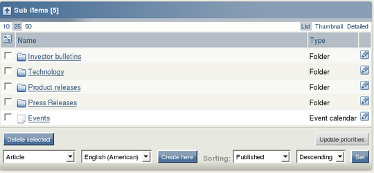
Sub items window
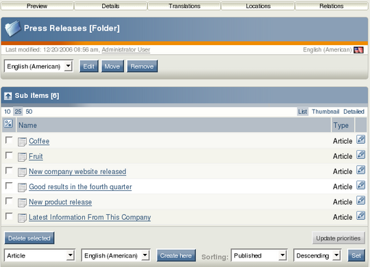
The Sub items window is always visible, as is the Preview window. Moreover, it is the only content information window of the main area that is not associated with a switch. It displays the node's children, meaning those that are beneath it in the node tree.
Sub items window
The Sub items window also provides the following functionality:
- creating new objects
- removing existing nodes
- editing existing objects
- configuring the selected node's sort settings
If you have a single-language site, the language selection dropdown list is not shown. It is also possible to access the context-sensitive pop-up menu described earlier by left-clicking the icons in the list.
There are various ways to navigate the Administration Interface. The two most common methods are clicking around and searching. You can also navigate to a specific node by clicking on your pre-configured bookmarks. The primary navigation zones when using the point-and-click approach are the main menu, secondary (left) menu, path and Sub items window.
Content navigation through the secondary menu and Sub items window
The most convenient method for navigating the content hierarchy is to use the secondary menu. This menu is used to explore the node tree by opening different branches just as you would do when navigating a local file system. Using the secondary menu for the first three tabs in the Administration Interface, you can navigate the Content, Media and Users branches. The + and - buttons to the left of each node icon are used to unfold and fold the branches of the tree at any level. Note that if JavaScript is not enabled in your browser, the tree in the secondary menu is completely unfolded at all times.
The tree can also be navigated using the path and the Sub items window. In both cases, you click the text links that correspond to the node to which you wish to navigate. Note that this takes much more time than using the tree menu, because every click forces the page to reload, while folding and unfolding the tree menu does not. However, your secondary menu might only show the main container nodes in the node tree. This is done in order to prevent a noticeable drop in performance when having to list all nodes on large sites. Thus, you will sometimes have to use the Sub items window together with the secondary menu in order to navigate to your desired location.
Searching for content
The built-in search engine indexes almost everything that is added to the site. Searching is used in many settings, including assisting navigation, listing an overview of content with some common elements, identifying particular content, locating content (such as a page) that you want to edit, move or remove, and finding a place to publish some new content.
The Search interface is located in the upper right corner. It is always present and can be used to search regardless of the part of the Administration Interface that is being accessed. (The one exception is edit mode, where the Search interface is visible but disabled.) The default behavior is that the system will search for the specified word(s) within the entire node tree.
A typical search procedure involves:
- In the search field, enter the name or content phrase to search for.
- Click the Search button.
- Matches are displayed in the main area. Click on the name of the node that you want to examine. The system will then display that node, and you can click the Edit button to edit it.
eZ Publish bookmarks
The built-in bookmark mechanism enables each user to store personal links to different nodes. For example, this mechanism can be used to bookmark (and subsequently quickly access) pages that you frequently edit. The Bookmarks window in the right area of the Administration Interface contains a list of the current user's bookmarks.
These bookmarks are specific to eZ Publish and should not be confused with the bookmark mechanism of your web browser. The Bookmarks window will not display any bookmarks from the browser, and the eZ Publish bookmarks will not be displayed in the bookmarks list in your browser menu. The list of bookmarks can be enabled and disabled using the + and - buttons. The Bookmarks window provides a button that can be used to bookmark the currently displayed node.
Managing and organizing your personal bookmarks - to delete existing bookmarks and add new ones, for example - is done through the Bookmarks interface located in the My account tab. This interface is accessed by either clicking the My bookmarks link in the My account tab or by clicking the Bookmarks link at the top of the Bookmarks window in the right area.
The Administration Interface contains many elements, including multiple windows, interfaces and tabs. The six areas of the interface are: main menu, path, secondary (left) menu, main area, right area, and Search interface. The main menu is a collection of tabs located below the eZ Publish logo and the Search interface. The secondary / left menu and the main area display elements that belong to the selected tab. Each tab represents some subset of the Administration Interface. For example, the Content structure tab gives access to view and manage most of the content that is published on your site.
The secondary menu provides access to content and interfaces that are associated with the tab that was selected from the main menu. If your browser has JavaScript support enabled, the secondary menu of the first three tabs is shown as an interactive tree. The main area displays the actual content and interfaces that are associated with the selected node. This is where most of the work is done. When viewing content here, you will see a row of switches at the top that are used for toggling information windows on and off. If all switches are turned on at the same time, the windows will appear in the same order as the placement of the switches (left to right): Preview, Details, Translations (multilingual sites only), Locations and Relations. The Sub items window is always at the bottom.
Searching for content is done by entering text in the search field in the top-right corner. In eZ Publish, default search behaviour is case insensitive and matches exact words or phrases.
The context-sensitive pop-up menu contains functions that are specific to the item from which the menu was invoked.
Resources
- eZ Publish Content Management Basics
- eZ documentation site
- An Introduction to eZ Publish Concepts - first article from this series
- Creating Content Quickly and Easily with the eZ Publish Website Interface - second article from this series
- Formatting Text with the eZ Publish Online Editor - third article from this series
